Seven decades of the inflation-adjusted Dow Jones Industrial average
Everybody has observed the renewed volatility of stock prices during the last few months. But for all the volatility, so far, the stock market has moved basically sideways since the end of 2017. The Dow Jones industrial average closed at 24,787 yesterday (April 17), only 0.3 percent different from the 24,719 it was at the end of December—with a lot of storm and stress in between.
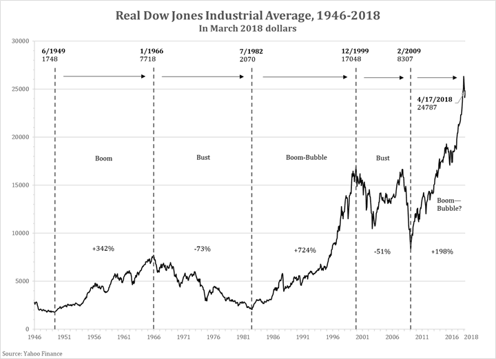
Of course, it has moved sideways at a high level. How high? For perspective, the following graph shows the DJIA over seven decades on an inflation-adjusted basis, expressing the history in March 2018 constant dollars.
We see immediately how much real stock prices can move over time, and how long the basic directional moves can last. The chart falls into five sections. We observe the great bull market of 1949-1966, followed by the great bear market of 1966-1982. Then another great boom from 1982 to the 1990s, which morphs into the runaway bubble of the late 1990s. Then a truly volatile decade which ends up in the big bust bottoming in 2009. Since then, the real DJIA is three times as high as at the 2009 low. In a longer view, it is 14 times what it was in 1949, 12 times as high as at the 1982 bottom and more than three times as high as the 1966 peak—all after adjusting out the endemic inflation of the times.
How high are stock prices now? Pretty high. The boom and its acceleration last year bears a worrisome resemblance to the shape of the 1990s. However, so far the bull market has lasted only about half as long as those of 1949-1966 or 1982-1999.
What’s next? Alas, to paraphrase Fred Schwed in his classic 1940 book, “Where Are the Customers’ Yachts?,” the one thing we all want most to know is the one thing we never can know. That’s the future, of course, especially the future of financial markets.


